What is Responsive Web Design and Why is it Essential?
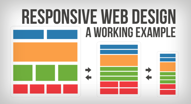
Responsive Web Design (RWD) refers to an approach that ensures a website’s design and layout adapt seamlessly to various screen sizes and devices. With the increasing use of smartphones and tablets, RWD has become crucial in providing an optimal viewing experience for users. It allows web content to be easily readable and navigable, eliminating the need for excessive resizing, panning, and scrolling. According to a report by Statista, mobile devices accounted for over half of global web traffic in recent years, which underscores the necessity for a responsive design.
Implementing responsive web design is essential for several reasons. Firstly, it enhances user experience and engagement, which can lead to reduced bounce rates and higher conversion rates. Google also favors responsive websites in its search rankings, making it a pivotal factor for SEO performance. In fact, Search Engine Journal states that a well-optimized responsive site not only improves accessibility but also streamlines maintenance as there is a single URL for all devices. Ultimately, investing in RWD means providing a better experience for users while boosting your site's visibility in search engines.
Top 5 Benefits of Implementing Responsive Web Design
Implementing responsive web design offers numerous benefits that enhance user experience and improve site performance. One of the primary advantages is mobile optimization. With over half of global web traffic coming from mobile devices, having a site that adjusts seamlessly to various screen sizes ensures that your content is accessible to a broader audience. Responsive design not only improves viewing on smartphones and tablets but also boosts your search engine rankings, as Google favors mobile-friendly websites. For more details, visit Search Engine Journal.
Another significant benefit of responsive web design is cost-effectiveness. Instead of creating separate websites for desktop and mobile, responsive design allows for a single site that adapts to all devices, which reduces development and maintenance costs. Additionally, this design approach enhances user engagement, as it provides a consistent look and feel across platforms, leading to improved conversion rates. For more insights on the economic impact of responsive designs, check out Smashing Magazine.
How to Optimize Your Website for All Devices: A Step-by-Step Guide
In today's digital landscape, it is essential to optimize your website for all devices to ensure a seamless user experience. Start by employing a responsive design, which allows your site to adapt to various screen sizes. Utilize CSS media queries to define specific styles for different devices. Additionally, consider implementing a mobile-first approach, where you design for smaller screens first before scaling up. This strategy ensures that essential content is prioritized for mobile users, leading to improved engagement and lower bounce rates.
Once your design is in place, focus on optimizing your website for speed. Compress images using tools like TinyPNG and leverage browser caching to enhance loading times. Test your website's performance on multiple devices by using Google's PageSpeed Insights. This tool provides valuable insights on how to improve your site's speed across different platforms. Finally, ensure that all interactive elements, such as buttons and forms, are easily clickable and accessible on both mobile and desktop, thus enhancing the overall user experience.