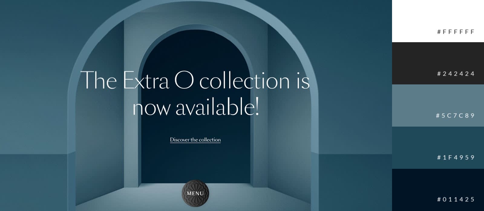
The Psychology of Color: How to Choose the Right Palette for Your Website
The psychology of color plays a crucial role in conveying your brand's message and influencing user behavior on your website. Different colors evoke different emotions and reactions. For instance, blue often represents trust and reliability, making it a popular choice for corporate websites, while red can evoke excitement and urgency, which is beneficial for e-commerce sites aiming to increase conversions. When selecting a color palette, consider the psychological impact of colors and how they align with your brand's identity and the emotions you wish to evoke in your audience.
To effectively choose the right palette for your website, start by identifying your target audience and the emotional response you want to elicit. Here are a few steps to guide your decision:
- Research Color Meanings: Understand the basic meanings behind colors, such as green for growth and health or yellow for optimism and warmth.
- Limit Your Palette: Stick to two to three primary colors and a couple of accent colors to maintain visual harmony.
- Test Your Choices: A/B testing different color schemes can provide insights into how your audience reacts.
By thoughtfully applying the psychology of color, you can create a website that not only looks aesthetically pleasing but also engages users and drives conversions.
Common Mistakes to Avoid When Selecting Website Colors
Choosing the right colors for your website is vital for creating an appealing user experience, but there are several common mistakes to avoid. First, many designers overlook the importance of understanding color psychology. Different colors evoke different emotions and can significantly influence user behavior. For example, blue often promotes feelings of trust, while red can create a sense of urgency. Failing to consider these psychological impacts can lead to a color scheme that does not resonate with your target audience.
Another frequent mistake is using too many colors or not enough contrast. A cluttered color palette can confuse visitors and detract from your website's overall message. Instead, stick to a cohesive color scheme that emphasizes accessibility and readability. Aim for a maximum of three to five complementary colors to ensure that your design remains clean and appealing. Additionally, make certain that there is enough contrast between text and background colors to maintain readability across all devices.
What Colors Work Best for Your Target Audience?
Understanding what colors work best for your target audience is essential for effective marketing and branding. Different colors evoke various emotions and associations, which can significantly influence how your audience perceives your brand. For instance, blue often conveys trust and dependability, making it a popular choice for financial institutions. In contrast, red can evoke feelings of excitement and urgency, which is why many fast-food chains incorporate it into their designs. Consider conducting surveys or focus groups to gather insights on color preferences specific to your demographic.
Moreover, the cultural context of your audience plays a crucial role in color perception. For example, green is associated with nature and tranquility in many Western cultures, while in some Eastern cultures, it symbolizes prosperity and wealth. To effectively engage your target audience, it may be useful to create a color palette that reflects not only your brand identity but also resonates with your audience’s cultural background. Utilizing tools such as color theory and psychology can aid in selecting colors that will likely appeal to your audience's feelings and beliefs.
