Understanding Color Psychology: How Colors Influence User Emotions and Behavior
Understanding Color Psychology is essential for anyone looking to enhance their brand's impact. Colors evoke emotions and influence decisions, making them a powerful tool in marketing and design. For instance, red often conveys excitement and urgency, prompting quick action, while blue is associated with trust and calmness, encouraging customer loyalty. By strategically selecting colors, marketers can create an emotional connection with their audience, which can significantly influence user behavior and engagement.
Moreover, the effects of color are not universal; they can vary based on cultural backgrounds and personal experiences. For example, while green is often linked to health and tranquility in Western cultures, it may represent something entirely different elsewhere. To effectively leverage color psychology, it’s crucial to consider your target audience's perceptions and cultural contexts. Utilizing color combinations wisely can lead to better user experience, increased conversion rates, and ultimately, a stronger brand presence in a competitive market.
The Ultimate Guide to Color Combinations: Creating a Cohesive Look for Your Website
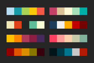
Choosing the right color combinations is essential for creating a cohesive look for your website. A well-thought-out color scheme not only enhances the aesthetic appeal of your site but also improves user experience and engagement. When selecting colors, consider the psychological effects they have on your audience; for example, blue evokes trust, while red can trigger urgency. Start by determining a primary color that represents your brand and then select one or two additional colors that complement it. You can use tools like color wheels to explore complementary, analogous, and triadic color schemes that maintain harmony across your design.
Once you've established your basic palette, apply it consistently across your website's elements such as headings, buttons, and backgrounds. A common approach is to follow the 60-30-10 rule: allocate 60% of your site's primary color, 30% for secondary colors, and 10% for accents. This balance helps guide the viewer's eye while preventing overwhelming visual clutter. Additionally, test your combinations against different backgrounds and in various lighting conditions to ensure readability and accessibility. By mastering these techniques, you can create a visually stunning website that effectively communicates your brand's identity.
Is Your Color Palette Hurting Your Brand? Signs It’s Time for a Redesign
When it comes to your brand's identity, the color palette plays a crucial role in how your audience perceives you. If your brand's colors no longer resonate with your target market or reflect current trends, it may be a sign that it's time for a redesign. Signs that your color palette could be hurting your brand include a noticeable drop in engagement, confusion among consumers about your brand identity, or negative feedback regarding the colors you use. The emotional impact of colors is significant, and if your palette isn't effectively communicating your brand's message, you risk alienating your audience.
Consider evaluating your color palette by asking the following questions:
- Does your palette align with your brand values and mission?
- Are the colors visually appealing and relevant to your industry?
- Have your competitors adopted different color schemes that resonate better with consumers?
