What Is Responsive Web Design and Why Is It Important?
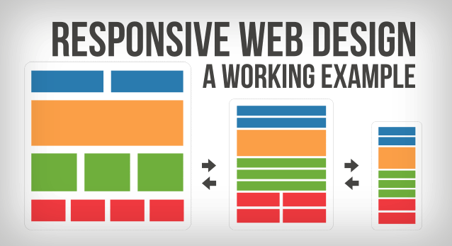
Responsive web design is an approach to web development that ensures a website's layout adapts seamlessly to various screen sizes and devices, providing an optimal viewing experience for users. This design philosophy employs flexible grids, fluid images, and media queries to adjust the elements accordingly. According to Smashing Magazine, the goal is to create visually appealing sites that are accessible on desktops, tablets, and smartphones without compromising functionality.
Implementing responsive web design is critically important for several reasons. Firstly, it enhances user experience by allowing effortless navigation and interaction regardless of the device. Furthermore, it's a pivotal factor for search engine optimization (SEO); Google recommends responsive design, and websites that are mobile-friendly often rank higher in search results. For more insights, visit Moz, where you can discover how responsive design contributes to better SEO performance.
Top 10 Best Practices for Mastering Responsive Web Design
Responsive web design is crucial in today’s digital landscape, as it ensures that your website provides an optimal viewing experience across a wide range of devices. Here are the top 10 best practices to help you master responsive web design:
- Utilize a fluid grid layout to create proportional relationships between elements, allowing for a seamless transition across different screen sizes.
- Implement flexible images that resize within their containing element, ensuring visuals are sharp and clear regardless of the device.
- Employ CSS media queries to apply different styles for specific screen sizes, allowing for tailor-made experiences.
- Limit the use of fixed-width elements to enhance layout adaptability, significantly improving user experience on mobile devices.
- Test your designs on real devices to pinpoint issues that may not be evident in browser emulators.
For more detailed insights, you can visit Smashing Magazine.
In addition to the aforementioned practices, consider the following:
- Prioritize mobile-first design by creating the mobile version of your site before adapting it for larger screens, which can improve performance and user engagement.
- Optimize page load times by minimizing HTTP requests, using compressed images, and leveraging browser caching.
- Use easily clickable buttons and links to enhance usability on touch devices, ensuring a smooth navigation experience.
- Keep your typography responsive by using relative units like 'em' or 'rem', allowing text to scale effectively on various devices.
- Stay updated on the latest web design trends and technologies by following relevant blogs and platforms.
For comprehensive tutorials on improving your skills in responsive web design, check out W3Schools.
How Responsive Web Design Enhances User Experience Across Devices
In today's digital landscape, responsive web design is essential for providing an optimal user experience across various devices, from desktops to smartphones. This design approach ensures that a website's layout and content automatically adjust to fit the screen size, making it accessible and easy to navigate. With mobile web traffic continually on the rise, websites that are not optimized for different screen sizes risk losing a significant number of visitors. According to a study by Statista, over 54% of global website traffic now comes from mobile devices, highlighting the necessity for businesses to adopt responsive design practices.
Additionally, responsive web design improves search engine optimization (SEO), a key factor in how easily users can discover a website. Google has explicitly stated that responsive design is their recommended configuration for mobile sites, as it enhances usability and decreases loading times, both of which contribute positively to search rankings. With a single, fluid design, developers can more efficiently manage content and updates, avoiding the pitfalls of maintaining separate websites for desktop and mobile versions. For more insights, consider reading this SEO basics guide by Google, which explains how responsive design supports better search engine performance.